Tuesday, September 1, 2015

1st ride for H2H challenge

Where does time go?  Well, this layout will give you some idea of where, or at least how, 2015 has been going for me.  In December of 2014, I started having a significant increase in pain and decrease in mobility and after months of adding meds, cortisone shots, and physical therapy, an MRI was finally ordered and a diagnosis was reached.  Unfortunately, it wasn't exactly the one I was expecting or hoping for, but it is what it is and now at least I am sure of what I'm dealing with.  So, when the goal is to stay out of a wheelchair as long as possible, it's really difficult to come to terms with the fact that the very thing you so want to avoid can, in some situations, help you in the long run.  In other words, I had to accept that renting a scooter for a day at the state fair was not "giving up" but in reality was saving me from a painful recovery for days, if not weeks.  I also discovered it made this traditional outing much more enjoyable for the whole family when I didn't spend the day limping, hurting, and having to constantly stop to rest.  And I didn't do so bad for my first time: out of a crowd of over 106,000 people, the only mishap I had all day was managing to run over my own foot!  LOL  At any rate, this whole process has been life changing and I'm thankful the "Ticket to Ride" theme at the H2H challenge blog gave me an excuse to document this part of my journey.

details:  I used the retired "Dotty 4 You" paper pack because I liked the bright colors, especially the bicycle and "stamp of approval" images, and that I was able to fit my picture in between them.  I used the Art Philosophy cartridge to cut the tickets and the letters for title as well as the tickets at the bottom for journaling.  I scanned my actual handicapped parking permit and printed it onto Colonial White CS and then altered it, fussy cutting the wheelchair image and adhering it to Lagoon CS, both to fit the space on the page and to make the colors blend better with the patterned paper.  I used a discontinued stamp set (small Chocolate alpha) to stamp the date I got my parking permit to cover the actual permit number, and included the admission and dated parking ticket as well as the receipt for the scooter rental.

p.s.  I wasn't quite satisfied with the first draft so I came back to it and ended up using my black alcohol marker, I inked up the orange letters in the title for greater contrast and I was much happier with that effect.


Happy crafting!
Annette


Sunday, March 15, 2015

grad card for retrosketches #156

So on one hand I have thoroughly enjoyed having my daughter home on spring break this past week but on the other hand I finally found my long lost mojo and was working on projects for two challenges, only to miss the deadline for both by mere minutes.  However, the deadline for one was extended due to pc difficulties (my sympathies, Arielle!!!) so here is my take on the current sketch at RetroSketches.


details:  All products are from CTMH.  Both designer paper are opposite sides of the same paper from the  Chalk It Up pack and the banner is in Lagoon CS.  I used silver shimmer trim and silver glitter paper for the stars.   I used the Doodled Designs stamp set in Lagoon for the drawn-looking circle and the graduation cap, diploma, and sentiment are from a new set, "Diploma Day" from the new Seasonal Expressions catalog available 4/1/15.

Happy crafting!  Annette

Thursday, March 12, 2015

Color My Heart challenge

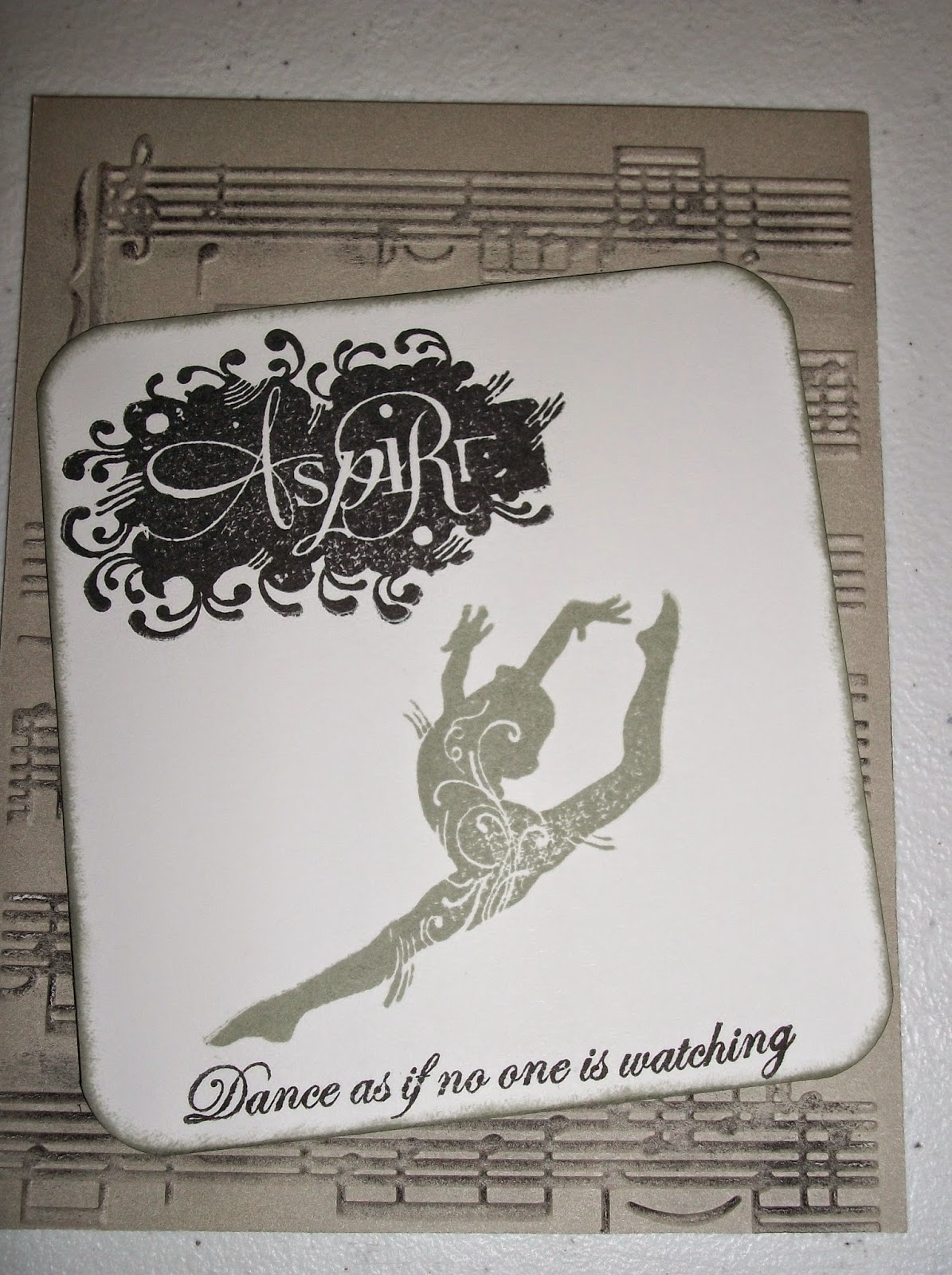
I have had a lot going on and on my mind of late, which can make it hard to feel creative.  However, I continue to follow my favorite challenge blogs and even refer new people to them.  Anyway, even though inspiration came at the last minute and I *just* missed the deadline for posting this, I wanted to share it.  It's a fairly CAS card, which I thought was fitting as this week's challenge at Color My Heart called for using black and white with Whisper, the lighter of the 2 grays that CTMH has in our palette.  This particular stamp (Aspire) is retired but I have never inked it until now, despite good intentions.

Anyway, if you have never checked out this challenge blog, I hope you will do so.  You will undoubtedly find inspiration from this great group of crafters!

Happy crafting!
Annette

Thursday, October 30, 2014

Halloween treat boxes for CMH #116

I kept telling myself I wasn't going to craft for Halloween since I'm now an empty nester, but then I decided to send treats to my daughter and her roommates at college.  And, as I'm sure any crafter can understand, once I got started crafting these cute little treat boxes I couldn't stop!  LOL  Luckily, there are a couple of Halloween-y challenges this week so I am submitting this at the Fantabulous Cricut Challenge Blog and over at the Color My Heart where this week's challenge it to use Sunset and Thistle (which just happen to be prominent colors in Close To My Heart's Scaredy Cat paper kit).
Anyway, I used some of the Scaredy Cat papers as some discontinued paper kits, 3 of CTMH's exclusive Cricut cartridges, as well as a discontinued stamp set for the "Happy Halloween" sentiment with the bat, and the Perfect Fit stamp sets -- I love working with these sets!

Happy (crafty) Halloween!  Annette


details:
  Art Philosophy cartridge was used to cut all treat containers as well as the scalloped circles in the center and the corresponding shapes for the Perfect Fit - Frames 2 stamp set.  The PF - Halloween stamp set was used for the smaller center shapes which could be cut with the AP cartridge or a 1 1/4" punch.   Jack o'lantern faces were cut from the Artbooking cartridge and the spider from the Artiste (with off-brand orange glitter glue for the eyes.  I chose to emboss the spider web design (from Paper Studios) rather than try to glue it onto 3-D projects.  The "Happy Halloween" sentiment with the bat is from an older, discontued CTMH set I borrowed from a friend; I can't find the name but the number is D1381).  White background/polka dot paper is from retired Spellbound kit and the darker fry box and spiders are from the Mischief kit, which is also retired.


Monday, September 1, 2014

Inspired by...

As soon as I got my new Chalk It Up paper kit I knew the first project I wanted to use it for was the Heart 2 Heart inspired by a movie challenge.  But, almost as soon as I decided that while this was the perfect paper to spotlight the movie I had in mind, my layout would be more about an unexpected pleasure in my life:  the fact that not only does my teenage daughter still want to go to movies with me but she and her best friend sometimes invite me to go with them.  Since my daughter graduated a year before her friend, her friend and I have even gone to see a couple of films together.  The three of us are self proclaimed book nerds and I love that we have a lot books and movies in common.  Even more than that, though, I treasure these times with my daughter because I missed out on these years with my own mother who passed away when I was 17 years old.

So, here is my project which was inspired primarily by the movie "The Fault In Our Stars," from the book by John Greene, as well as the favorite movies I have seen with just my daughter, just her friend, or the three of us together.  I have also included it at this week's Color My Heart challenge to use Lagoon, Flaxen, and Sorbet, which happen to be featured colors in the Chalk It Up kit.


details:  Chalk It Up paper kit, Circus alphabet (July stamp of the month); and the Artiste Cricut cartridge for the word bubbles and the film strips (each strip is actually 2 individual strips "welded" together using my Gypsy).

Happy crafting!  Annette


Wednesday, June 18, 2014

sketch challenge at CAS

I *just* missed the deadline to actually enter this challenge but I was in need of a little crafting therapy today so I whipped this out over my lunch hour, and I wanted to share it anyway because the sketch from (CAS) Colours and Sketch Challenge #78 was so versatile it really had me thinking but no one else used torn paper for their project.

details:  I went back to one of my all time favorite CTMH papers, For Always, which {sadly} is retired, but it lends itself so well to torn paper projects.  I backed the patterned papers with Ruby cs and used blank ink and another piece of Ruby cs to stamp the sentiment from the Casual Expressions set.  While this is one of the sets that is Cricut-compatible (specifically, the Artiste cartridge) but I hand cut this one just for the sake of time.


Happy crafting!  Annette

Sunday, June 8, 2014

New stamp, old paper for AHSC

Nothing like a few new bumps in the road of life to remind you of who your true friends are, not to mention how LUCKY you are to have them in your corner.  I love this particular stamp from the Lollydoodle kit and have had it in mind for a 'just because' kind of card for my best friend but her favorite color is red and she's just not into the pastel colors of that particular kit.  So as I was working on the ongoing task of organizing my stash to better fit my craft area, I was inspired by an older paper kit which just happened to be one of my favorites because I *love* the quilted look of this paper but it also had a rich, vibrant red as one of the main colors AND the stitching in the pattern really lent itself well to this stamp.  I was further inspired by this week's sketch at Atlantic Hearts Sketch Challenge.  All products used are from CTMH but unfortunately, just about all of them (except the stamp and the Cocoa cardstock) are retired or discontinued items.  But, hey, if you can't break into your most precious stash items to make something  special for your BFF, what's the point of having all this stuff?
details:  As mentioned, the stamp is from the Lollydoodle scrapbooking Workshop On The Go and the dark brown "base" pieces are from Cocoa cardstock.  Both patterned papers are from the retired "Stella" kit and I used the ribbon and little faux button brads from the Sunset mini-medley embellishment set, the white crocheted doily from the White Daisy mini-embellishment set, and one of the antiqued copper designer brads (all of which are retired) in the center of the doily for a more flowery look.  Just fyi, I also used these same papers and basic arrangement for a 6x4-inch title piece for a future pocket-style page to celebrate my 32 1/2 year friendship with my BFF, although I could easily devote an entire scrapbook to the things we have been through together --- if only we had taken the pictures to go with the stories!

Happy  crafting!  Annette
.